Intro
One design system that let 10+ airline and bank partners send on-brand email without a designer touching it.
The old template broke in Gmail, was illegible on mobile — where most opens happen — and couldn't flex across 10+ retail, airline, and bank partners. Every campaign meant choosing between speed and quality.
I rebuilt it as one fluid template with tiered modules — not four separate ones — so a marketer could launch a campaign without a designer touching it.
Role
Principal Product Designer
Status
Shipped2025-26
Type
Design SystemEmail
Tools
FigmaEmail on AcidMovable Ink
Problems
- Email is a member's first contact with merchant offers in the program, and on mobile — where most opens happen — it rendered broken and illegible: full-width buttons on every offer, 12px type, one offer per scroll.
- Ten-plus partner brands broke the template under real content.
- Every send needed a designer to patch rendering, which slowed delivery.
Solution
- One fluid template, 375–600px, replacing four separate templates.
- Defined tiered modules and a strict image/button spec that map to code.
- Focused on marketer self-serve over designer-touch completeness.
Results
- Adopted across 10+ partner programs.
- 550 unique emails built on the system, Jan–Jul 2025.
- 168.4M sends delivered, 1.7M clicks generated.
- 150% sales lift on mobile sends.
Final screens
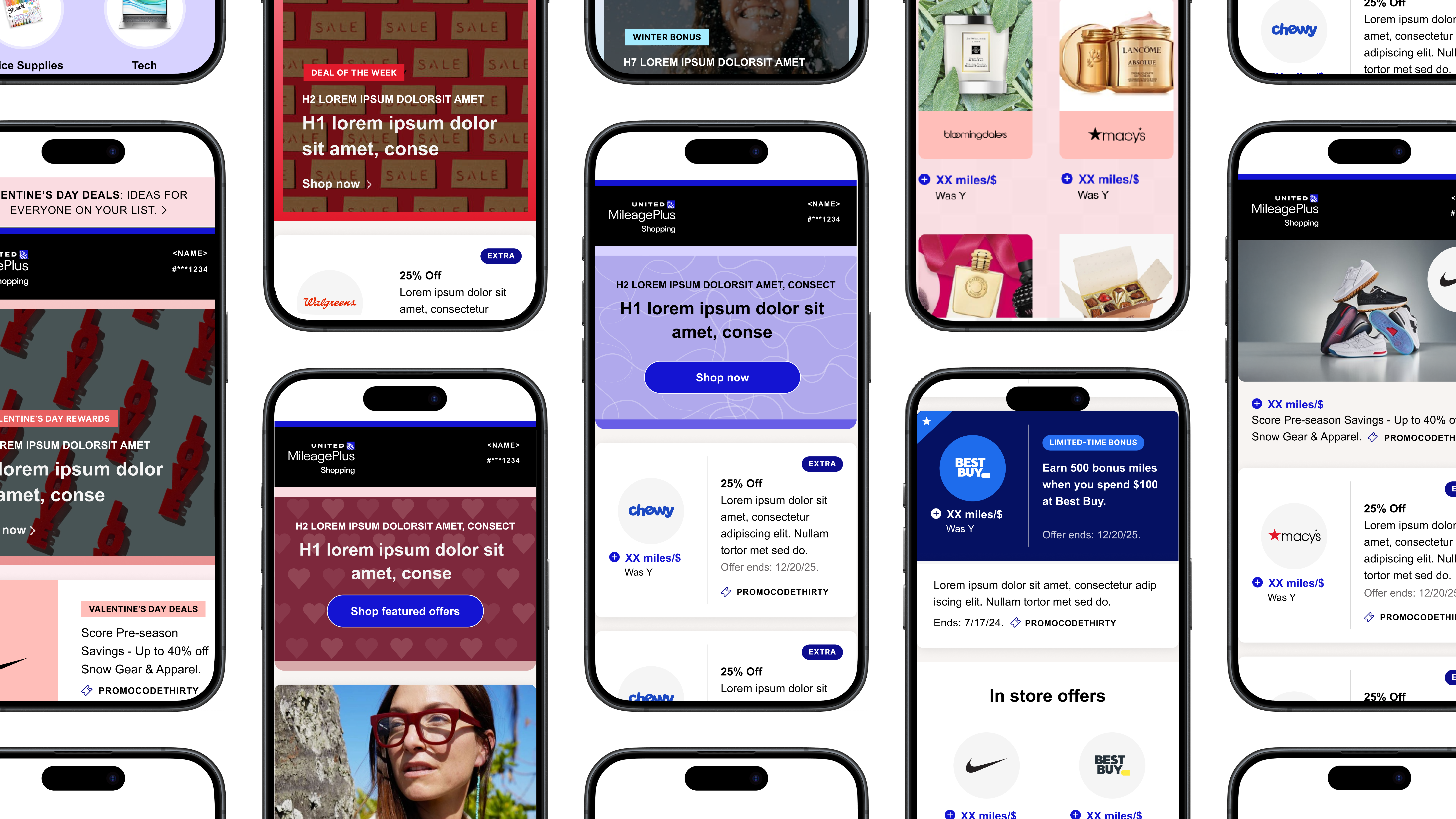


Scroll to see more ↓
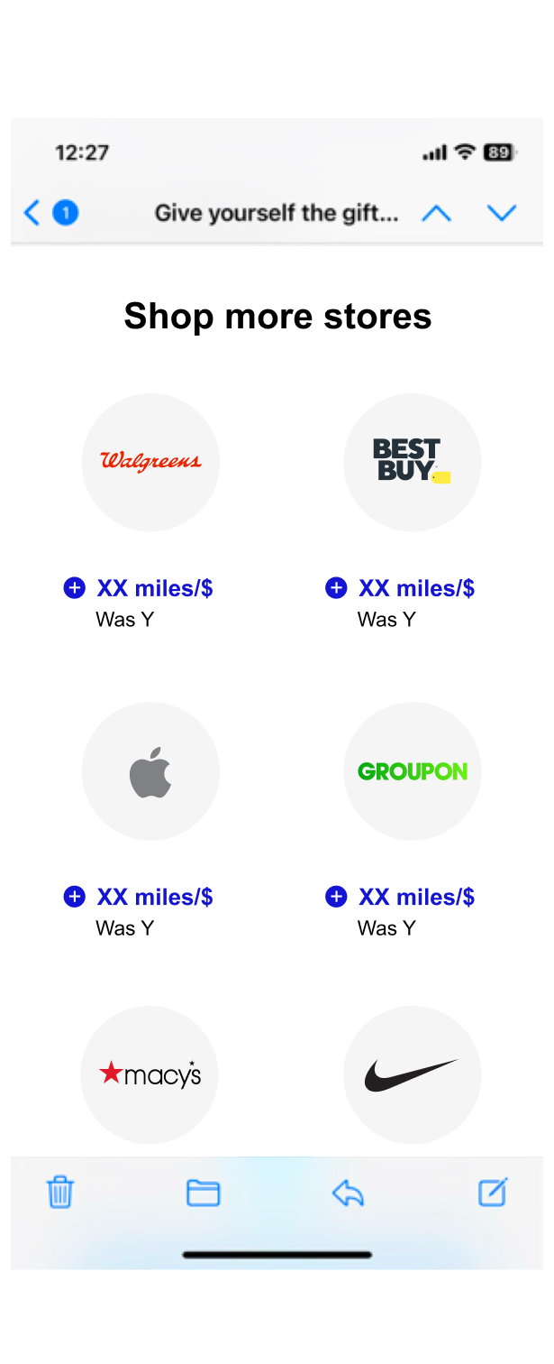
Full email send, merchant offers
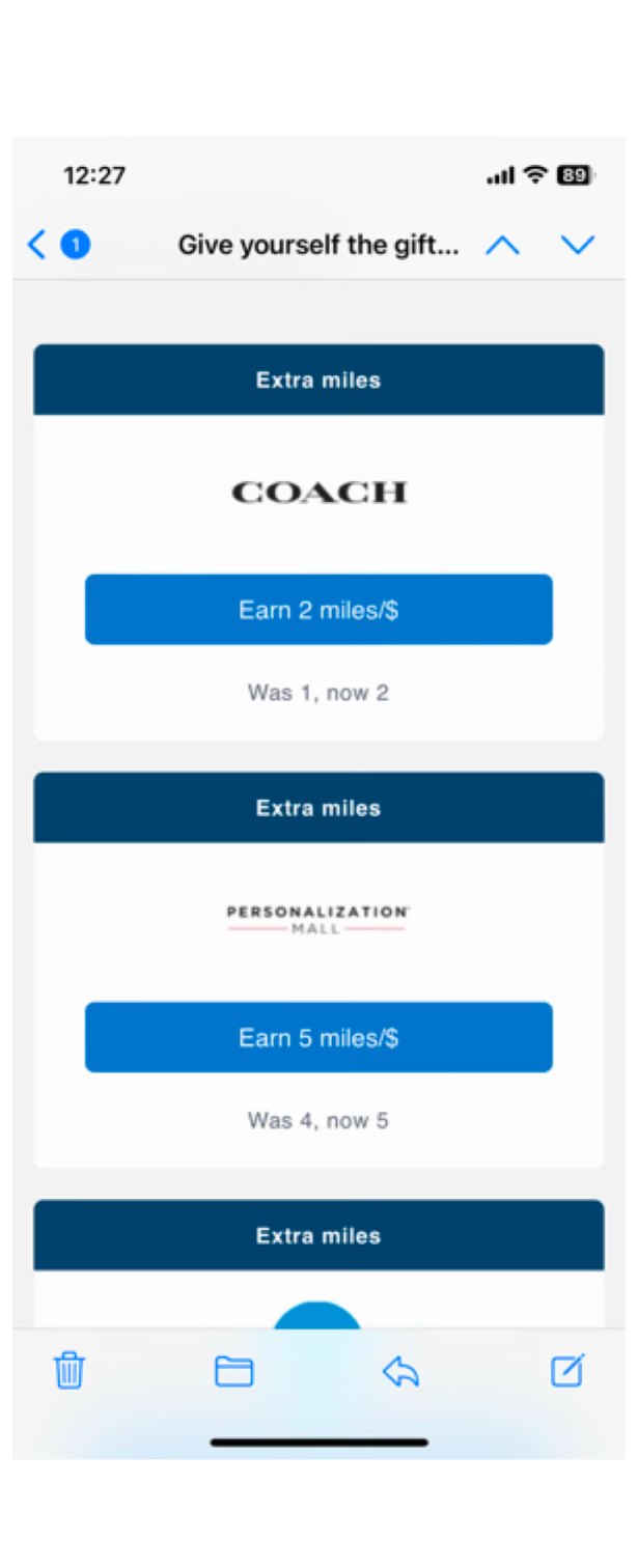
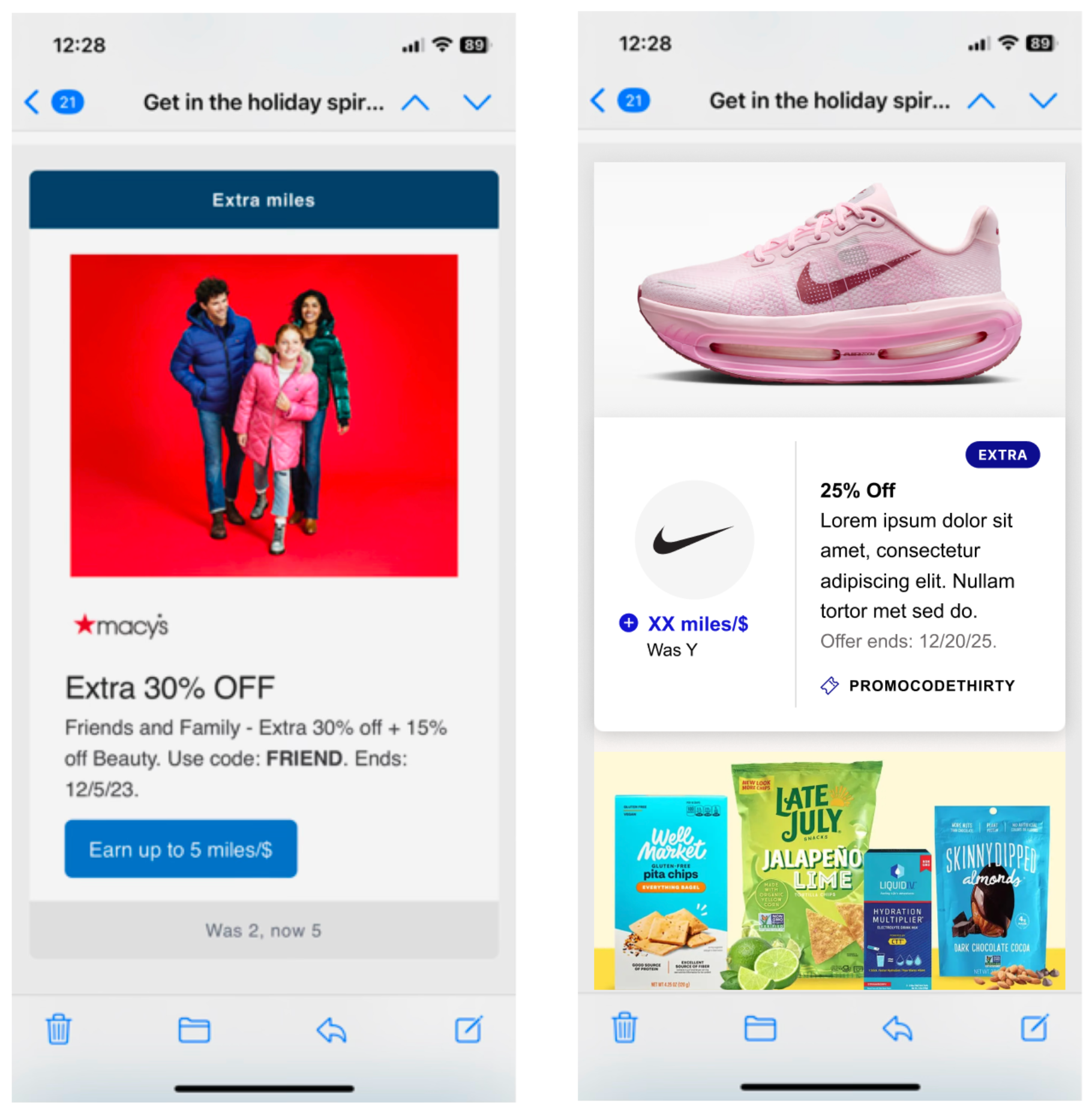
Individual merchant module
Process
Setting the scene
Desktop-first, shipped to a mobile audience.
Shop-and-earn programs sit between two businesses: a partner — an airline or bank — offers the program as a retention channel, while the 1,100+ retailers on the other side pay for it as an acquisition channel. A member clicks from the partner's portal to a retailer and earns miles or points on the purchase. Email is where they first see those merchant offers — the send either earns a click or gets deleted.
This template powers three email sends a week across 10+ partner programs. It was built for desktop, then patched for mobile after the fact.
Email members are 10x more valuable than average members, and the channel returns $36–$42 for every dollar spent — but it was running on some of the least modern tooling in the product.
Why email is a different medium
Every email still renders inside decades-old constraints: layouts are built with HTML tables, not flexbox or grid; styles have to be inlined rather than written once in a stylesheet; and Outlook on Windows renders email using Microsoft Word's engine, not a browser — no flexbox, no CSS grid, and unreliable support for basic things like rounded corners or web fonts. Any design has to be built for that lowest common denominator first, then layer up for clients that support more.
The foundations
One module system, not four templates.
Instead of maintaining separate layouts per partner, I defined a tiered module system: real product imagery where it earns its space, more offers in the same scroll where it doesn't, and one consistent anatomy underneath so repetition reads as rhythm instead of noise. Each module is built as one flexible container that expands from mobile to desktop keeping content fixed and legible at any viewport screen size.
Merchant offer, with image
The top of the send and the most expensive placement on the rate card. It has one job: earn attention in the first three seconds.
1
2
3
Before
After
1Full-width image at a fixed 502×272 — one spec, enforced across every partner send.
2Transparent logo on a circle — the affordance that replaced the button.
3No button anywhere — the entire module is the click target.
Merchant offer, without product image
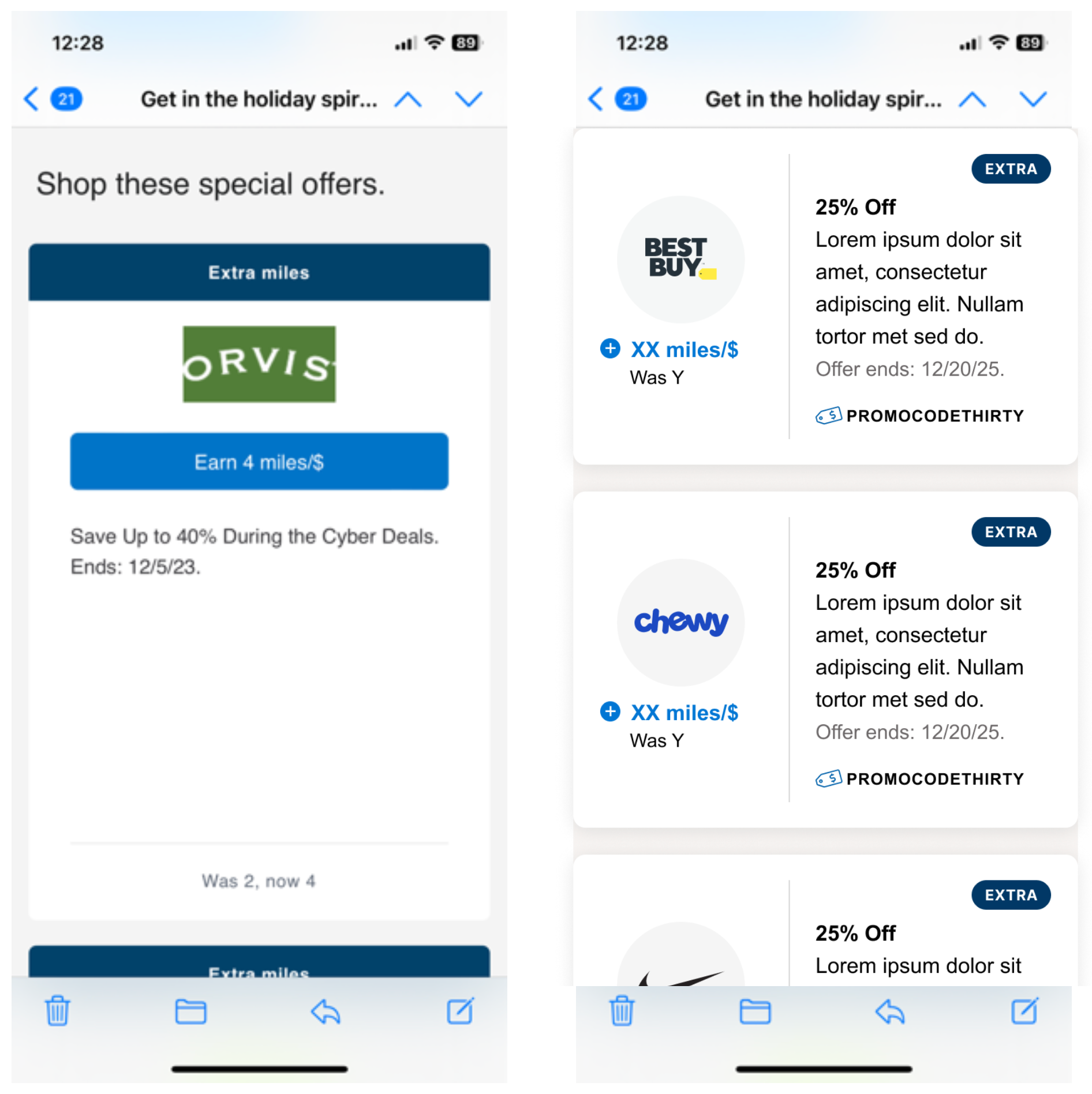
The tier that carries most sends. The old one left empty space below every offer; the redesign uses a fixed height that always looks full, so roughly three fit where one used to.
1
2
3
Before
After
1Logo and earn rate left, offer copy right.
2Roughly three fit in the space one old module took.
3The promo code finally gets real emphasis instead of being buried.
Merchant logo only
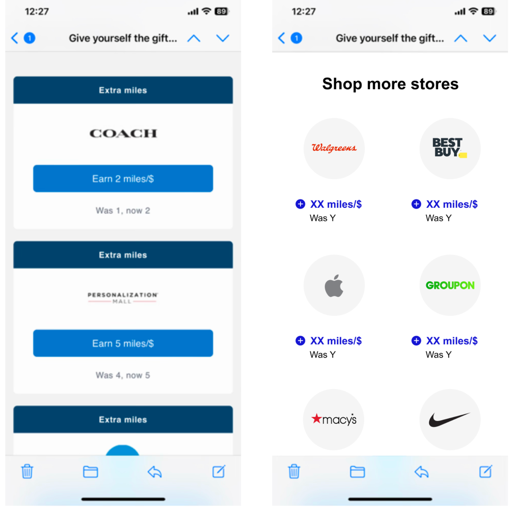
A compact, image-free grid for long-scroll sends — no offer copy, no dates, nothing to go stale. Structurally it's Standard with the offer stripped out: same component, less content, so imagery is never required for a module to hold up.
1
2
3
Before
After
1Six merchants in the height of two old offer modules — twenty brands in a send instead of six.
2No copy, no dates, nothing to go stale — the logos carry it, and they only work because they're finally sharp.
3Structurally it's Standard with the offer stripped out — same component, less content.
The foundations
A bonus tracker should track the bonus.
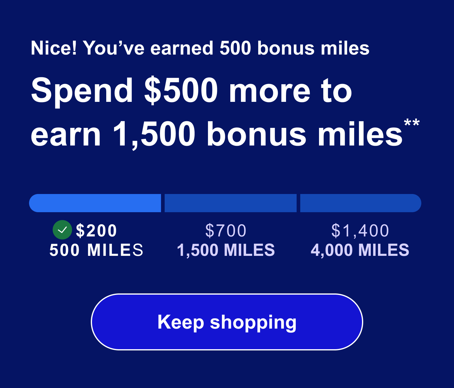
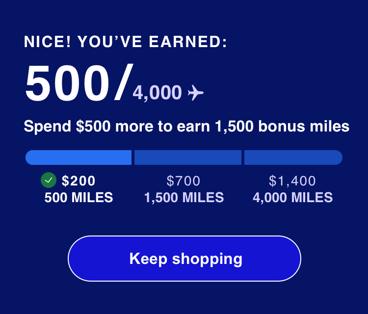
Marketing wanted the spend amount to lead — that's how bonuses had always been presented. I argued the opposite: gamify what a member has already earned and they keep going; lead with what they still need to spend and it reads like a bill. The debate turned out to be about hierarchy, not content — earned miles take the headline; the spend amount sits right beneath it, phrased as the next action.
Spend-led
What you still need to spend leads.
Earned-led — shipped
Progress leads; the spend sits right beneath.
Progress that motivates, not just informs
Email can't rely on hover or tap states, so nothing sits behind an interaction — earned miles, three tiers and their rewards, and the next action all show at once, in one small card.
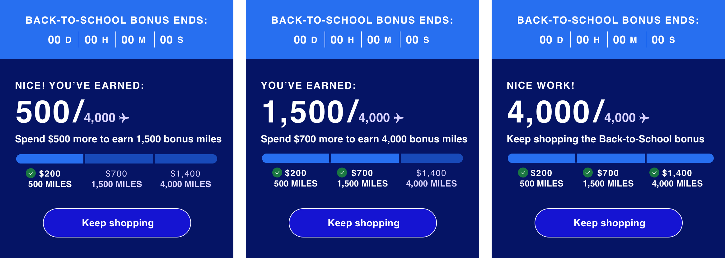
Tier 1 earned
Credits the win, then names the next tier.
Tier 2 earned
Checkmarks make progress feel permanent.
All three earned
Drops the threshold, keeps the invitation.
Feature
Same modules, tons of theming options
Colors and imagery live as tokens on the module, not hardcoded — so a campaign moment is a retheme, not a rebuild. Creative drops in a hero image and swaps one hex value; the module handles the rest. No dev ticket, no rebuild. Emails can be themed for black friday, holiday, or any theme creative wants with an easy switch.
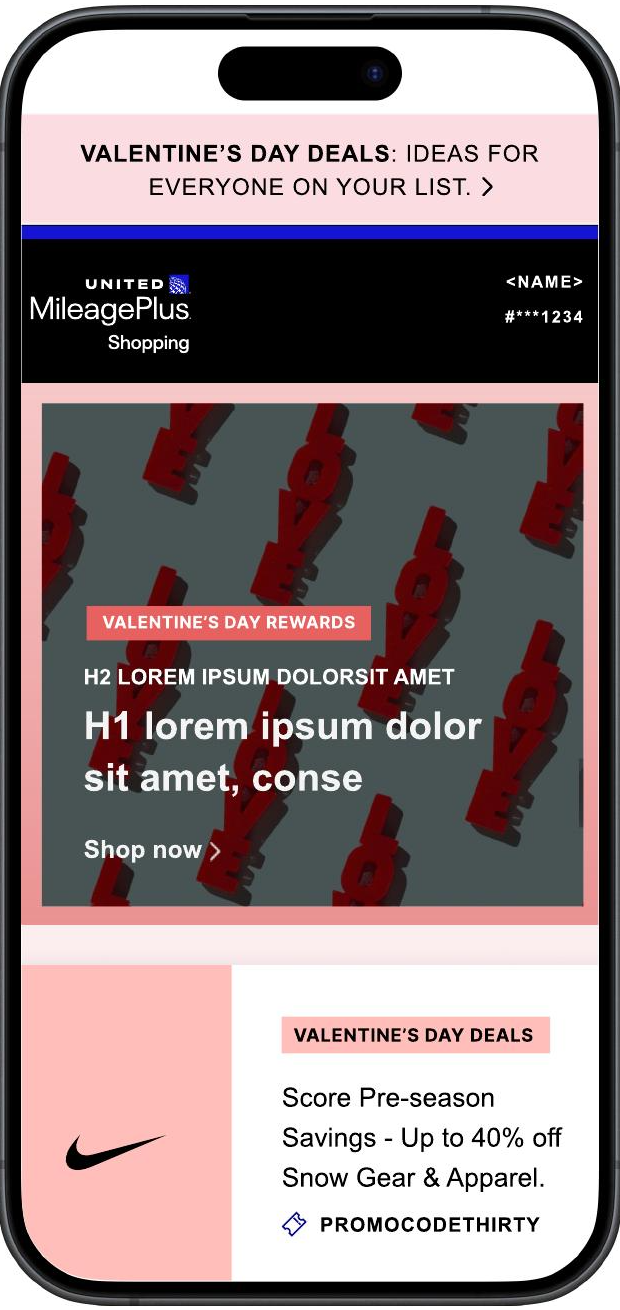
Valentine's Day
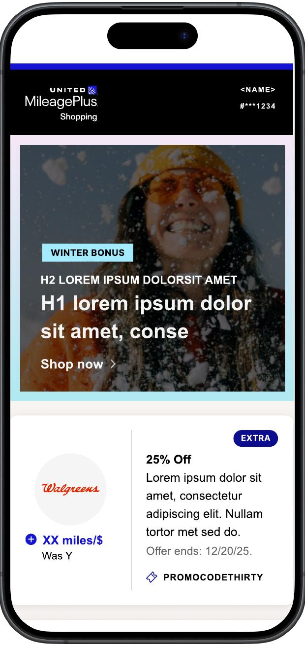
Winter bonus
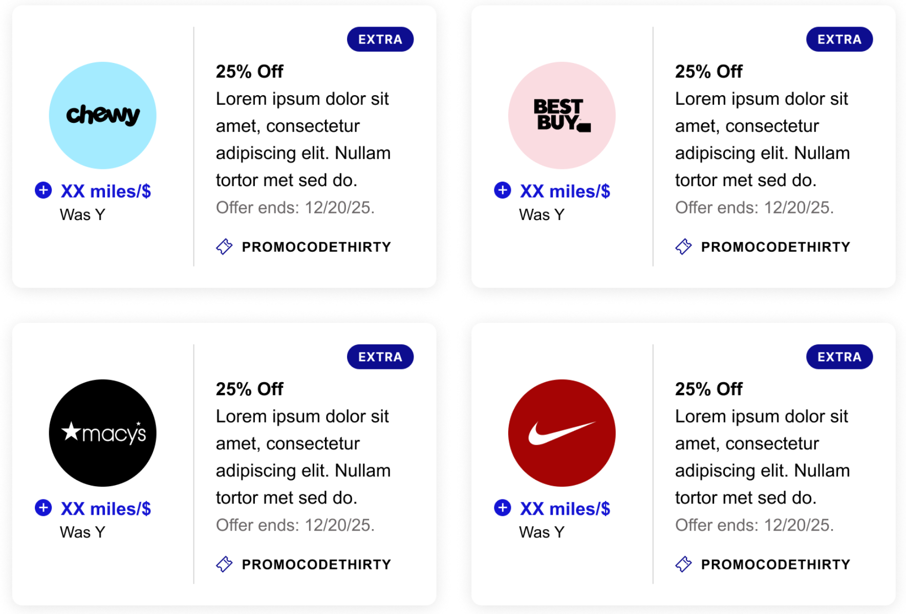
ALL THE MODULES, MULTIPLE CLIENTS
Same system, different brand.

UNITED AIRLINES

AMERICAN AIRLINES
Results
Results
I took the buttons off. Clicks went up.
The whole redesign shipped together, measured live against the existing template across two United campaigns and four send dates — 610,000 recipients, 27% of sends. Click-through, click-to-open, and shop rate all rose against the control, while deliverability, spam complaints, and unsubscribes held steady. It became the standard for rewards email across every client, and American asked when the site would be more like this.
168.4M
sends delivered on the new system
550 unique emails, Jan–Jul 2025
Can this retheme by Friday?
It's already live
one system, 10+ client brands
Retheme by token, not by rebuild
1.7M
clicks generated
Without touching deliverability or unsubscribes
10+
client brands sharing one system
610K+
members reached in validation
10x
more valuable, engaged members
550
unique emails built on the system
Learnings
A badly rendered logo doesn't read as a small flaw. It reads as a program not worth trusting.
The pushback was real — it looked cosmetic, and dev didn't want to touch a database feeding site, email, and the extension at once. I made the case on trust, not aesthetics, and took it to the VP when that wasn't enough. Winning it mattered beyond the logo itself: a logo that renders cleanly on any background is what made theming, dark modules, and the circle affordance possible everywhere else.